No Man's Sky: Now With Writing and Design!
No Man’s Sky just got a massive 4GB update, bringing the version to 1.3. It’s the third such update that Hello Games has released over the last year.
It’s so radically different now compared to launch that they’ve essentially remade the game.
Writing/Story
Up until now, No Man’s Sky has had a weird, ethereal story. There was a big creepy space entity thing known as Atlas that wanted you to do…something.
There were these other races randomly hanging out in places. You could slowly learn their languages. And sometimes they’d trade with you.
Some good guy dudes flew around in a big ship and told you that the Atlas might be evil and uh…
You explored lots of planets.
It was all a little disjointed and endlessly mysterious. And without spoiling anything, the original ending just left a lot of questions on the table. I never felt motivated enough to see it myself and ended up watching it online. I enjoyed the story…but it never provided me with much motivation to keep going.
Now, all of that has changed.
The entire story has been rewritten and overhauled. I can’t think of another time that the story of a game was so extensively re-done.
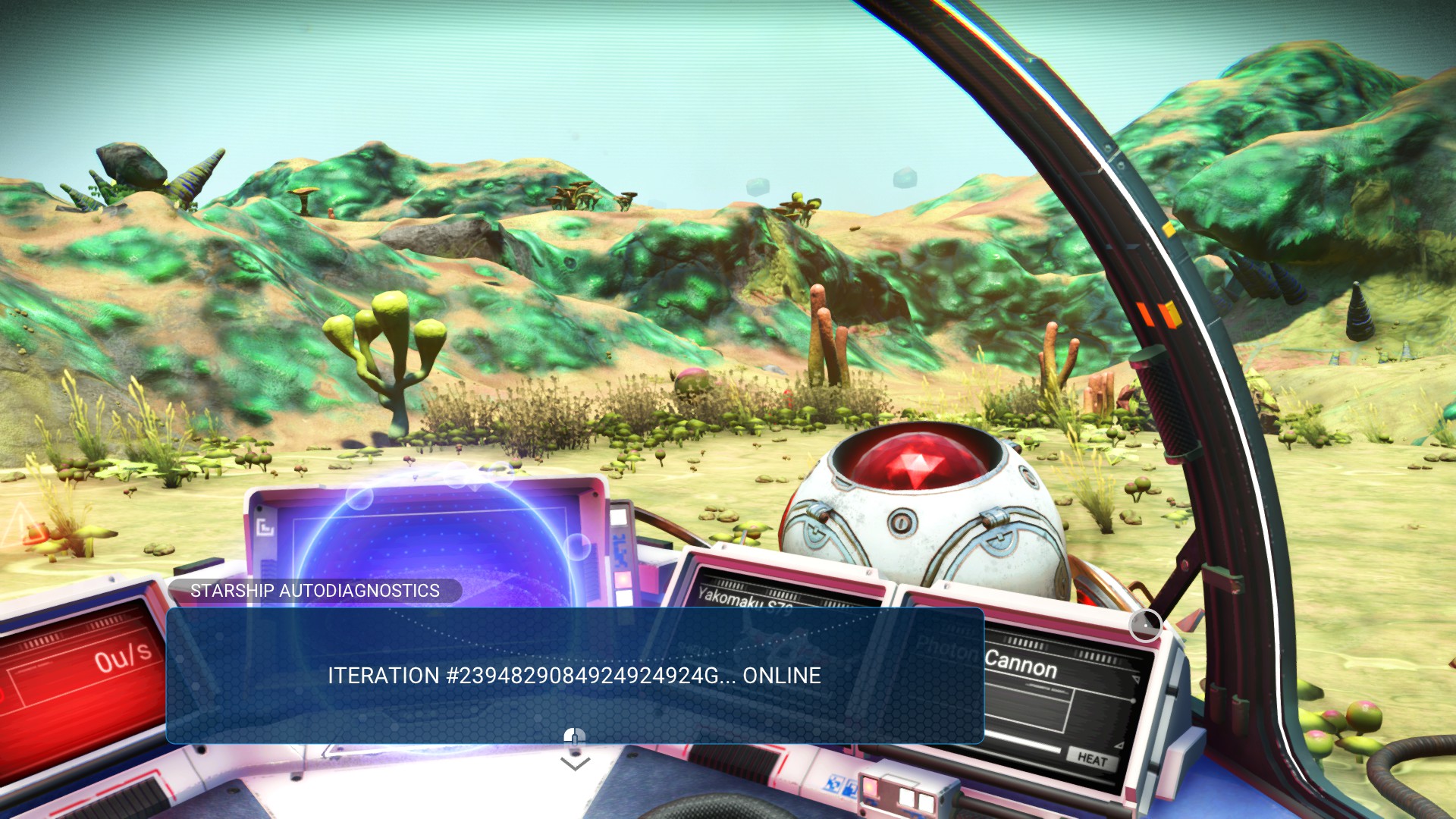
Now, right from the beginning of the game, everything is a little bit more contextualized. There’s still a sense of mystery…but there’s also a concrete quest line for you to follow that’s tied in with lots of new dialog and exposition.
In the original game, it was possible to miss the beginning of the story entirely if you didn’t click a certain object. Now that doesn’t happen. There’s a clear main quest line to follow, tons of randomly generated side quests to pick up, and proper conversations to engage in with other aliens in the universe.
It’s great.
UI Improvements
I wasn’t expecting the whole UI to receive a massive overhaul. But it’s really cool.
The dialog/story UI is completely new. Instead of just floating onto the screen slowly and presenting you with occasional choices, dialog now shows up in easy-to-read text boxes that you can quickly click through, if you want. And the dialog choices make a lot more sense, especially if you’ve learned some of the alien languages.
Characters you’re talking with are now located in the center of the frame, Bethesda-style, and I love the new depth of field effects behind them.
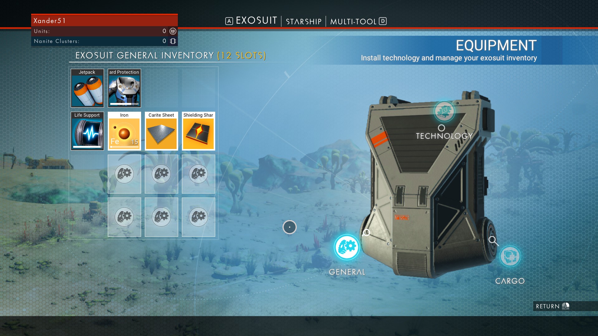
UI improvements stretch to every corner of the game. The inventory is much easier to use now, and you have dedicated areas you can install tech upgrades in, rather than having to cram all of your stuff onto one screen.
Although part of me liked the weird challenge of having to fit all of my upgrades and the stuff I was carrying into one screen, this new compartmentalization is much easier to wrap my mind around. And, it provides additional gameplay hooks because now each category of my backpack/ship/gun can be upgraded with new slots. And this progression is more satisfying.
Items that used to just be simple clickable objects that would pop out a reward now have some additional gameplay attached to them. Broken machines must now be repaired. Terminals with weird tentacles or goop on them must now have that stuff cleared away before you can use them. They’ve used the same interfaces they already had to better frame what you’re doing, and better immerse you into the game.
In this screen, the terminal is covered in goop and I have to choose whether I want to carry the goop around, or throw it away.
Little bits of extra gameplay like this are now littered throughout the game, and the improved UI makes all of this a little bit more fun. The meditative explorational aspects of NMS are still there, but now the list of “Stuff you can do” is bigger, and the game is more engaging and dynamic minute-to-minute as a result.
The binoculars UI is different. The ship UI is improved with a new holographic map. The options screens include a brand new quest log with clearly laid-out objectives, and a new screen that teaches you how all of the game’s systems work.
It’s a dramatic overhaul of the user experience, and I think all of it is really smart.
Multiplayer?
There’s multiplayer now! Sort of.
It works kind of like Fable II.
If you happen to come across another player, they’ll appear as a floating orb. You can voice chat and interact with them on a basic level…but that’s about it for now. Hello Games is teasing that more multiplayer features are coming, too.
I never minded the near-total lack of multiplayer in No Man’s Sky. The asynchronous discovery stuff was good enough for me. But it’s really cool that they added this after a year of fan outcry, and I’ll be curious to see what more they do with it.
New Visuals/Terrain Sculpting
The last update dramatically improved the visuals, to the point where I thought for a second that something was wrong with the game.
This one adds even more new visual features, and I haven’t noticed a huge performance impact on my PC. Things were a little hitchy on first-boot, but it was fine after a system restart.
Most of the terrain textures are now higher-resolution. There’s a bunch of new plant and ground material that uses much better assets. Buildings now have more possible appearances. The cool hyper-bright and colorful lighting model from the previous patch has been further refined.
If you got way into the base-building stuff they added before…you can now also sculpt the terrain! I haven’t played with this much yet, but it’s a great new addition that should please fans of creative/building games.
The story mode and the creative aspects are now both fully-developed, instead of feeling like half-hearted takes on other more successful genres.
Final Thoughts
I finally feel compelled to play all the way through this game.
The new story and UI systems have a much stronger pull on me than the gentle exploration of the earlier releases. It’s still entirely possible to ignore that stuff and just wander around the endless universe…but I actually wantto see the content now.
It’s not just a chill game about space any more. It’s a fully fleshed-out play experience.
I’m not sure how Hello Games had the resources to make this much new content for the game in the year after its release. Most game studios don’t get to rewrite all the text in their story…let alone add 30 hours of brand-new story content.
Has Sony been secretly pumping more money into this product to try and give it a long tail? Was the game so cheap to make in the first place that its modest success was enough to keep development going?
I applaud Hello Games for staying committed to this game in spite of so much backlash. I never totally understood the anger directed at this game. It felt to me like fans had done more to delude themselves than Hello Games ever did.
But that’s just my perspective.
This new patch is really something, and I’m glad to see the game in the Steam top sellers list again. Now is the perfect time to jump into this game if you never played it before, and if you already own it and haven’t touched it in a while…it’ll feel like a whole new thing built on the same foundation.


